Amnesty International USA is a global movement of millions of people demanding human rights for all people–no matter who they are or where they are. Amnesty wanted to redesign its flagship website to satisfy three main goals:
1. Center inspiration and inspire engagement
2. Create clear pathways for users to take action
3. Re-organize the website based on user needs rather than internal structures
Content Strategy x Theory of Change
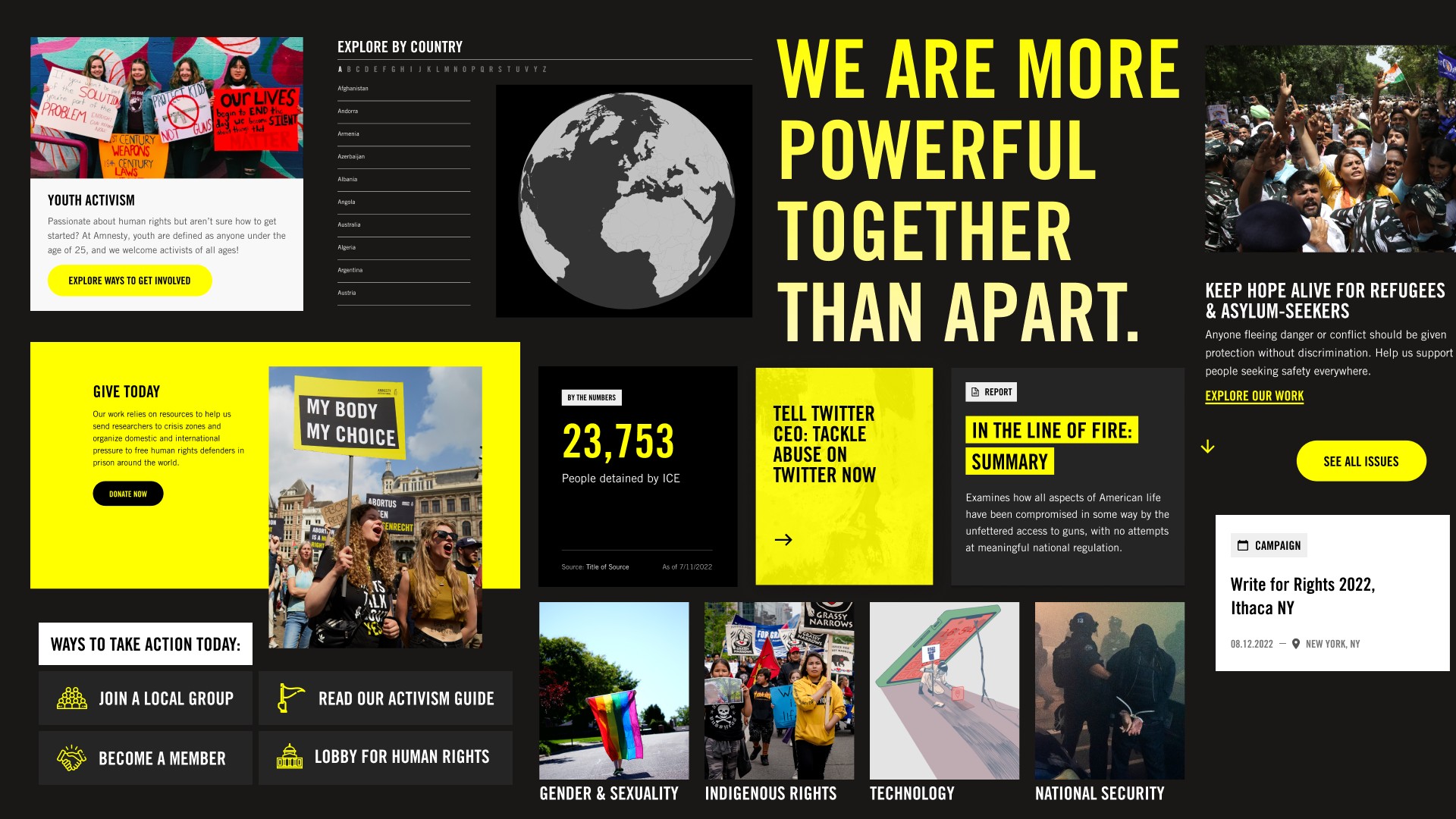
We transformed the homepage into a digital front door to Amnesty’s work allowing users to go deep, but only after understanding the full breadth of work they do. Centered around their three-tiered theory of change, (research, advocate, and mobilize) the homepage features audience-specific calls to action, a simple and direct main navigation, and flexible space to promote critical campaigns. Once users identify what they’re trying to do on the homepage, they’re guided through pathways to reach their goals.
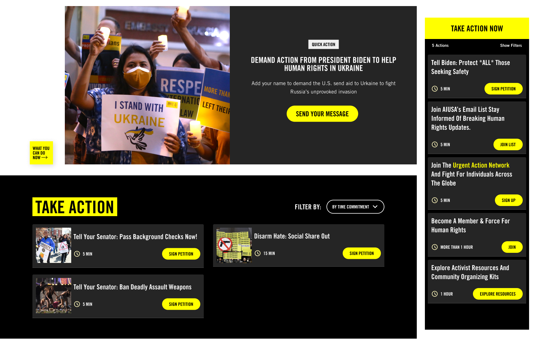
Special Feature: Action Drawer
The site features an ‘action drawer’ that uses a tagging and taxonomy system to dynamically coordinate with whatever content type the user is on. So when a user is reading about an issue–for example, gun violence–they’ll be shown immediate and filterable actions they can take related to gun violence.
Additionally, many users only have a few minutes to skim a headline or sign a petition. To accommodate this, the action button floats in the bottom left corner, and all actions display time commitment. Now, even if users are pinched for time, they’ll still know what they can do to make an impact.
Special Feature: Style Guide
The Amnesty style guide is a comprehensive library of all the existing blocks and components available on the website. Each block is paired with guidelines to help content editors understand their particular use cases, with many blocks offering pre-set, accessible options for things like color or background choice. This gives editors the freedom to think outside of pre-set templates and guardrails so they stay true to the brand.
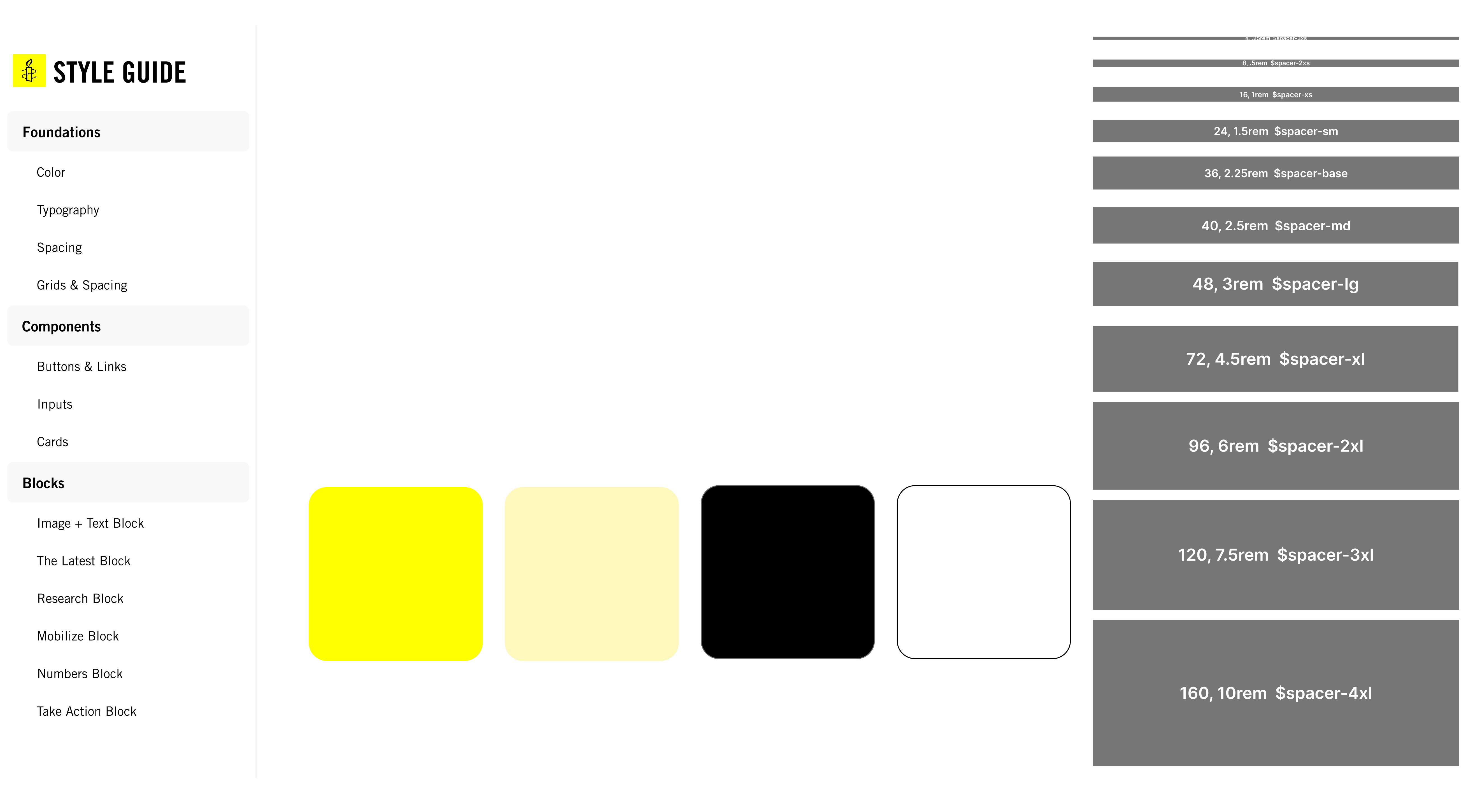
When it comes to accessibility, the style guide is exceptionally future-facing. Before, we’d have to test hundreds of site pages to catch all accessibility errors. Now, because the style guide reflects the live components on the site, we can run accessibility tests against one page (the style guide) and get a robust understanding of sitewide accessibility. And any frontend changes–for accessibility fixes or otherwise–only need to happen in one place to be applied to the entire site.
This sort of headless structure (having a decoupled frontend and backend) has benefits beyond accessibility and ease of maintenance. Because the frontend is portable, it can applied to other platforms such as new microsites, or even to a future new content management system.
Results and Early Wins
One month post-launch, the site saw:
- 24% increase in clicks from Google search results
- 17% increase in users coming from organic search
- 4% increase in new users from all sources
- 11% increase in average engagement time
Additionally, the action drawer has encouraged more users to click on actionable links from Issues & Campaigns pages. In the first month post-launch compared to the previous month, clicks on action links increased 613.33% (535 vs. 75 clicks).
Explore More